If you want to help people making better decisions, you can achieve this with better choice architecture. But what is a choice architecture? Anyone who designs the environment in which people make choices is a choice architect. There’s choice architecture all around you. Think about menus, curriculums, or store layouts that decide how you walk inside a store (you probably all have been in an Ikea once, there it’s obvious how choice architects have designed the way you cruise the Scandinavian furniture epicenter).
A choice architect makes choices about how to present information or an environment for you. Although nudging is all about maintaining people’s freedom of choice, choice architecture isn’t neutral. You can compare it to regular architecture; it’s not possible to design regular neutral architecture. Think about the design of the building you’re probably in right now: it’s not possible to have designed that building completely neutral. It had to have doors, stairs, etc.
Choice architecture is not neutral.
The same goes for choice architecture, it affects how people make choices, and you have to make a choice yourself on how you present a choice. Richard Thaler often refers to the example of cafeteria meal planning. They found out that the way food was presented to kids in a school cafeteria effected what they would eat for lunch. The first choice presented to them was the prevalent choice. Someone responsible for the cafeteria then has several options:
- Put the healthy options first, to promote more healthy eating behaviour
- Start with the unhealthy options, to make kids more fat (could be he/she has a chubby kid and wants other kids to gain weight too, to stop the bullying)
- Go for the most profitable as first option, to make the finance director happy
- Present the food randomly, which is also a choice (confusing, but a choice)
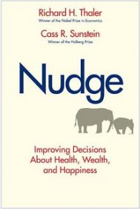
The point is: you always have to make a choice. Choice architecture is not neutral. But some designs are better than others. Why not do it in a way that makes people feel better? That’s what nudging is all about, and which is the theme of the book ‘Nudge’ to help people towards making better choices.
Nudging: making better and healthy choices
In the book ‘Nudge’ they explain six principles of good choice architecture that will help people make better and healthy choices:
Incentives
People make better decisions if you provide the right people with the right incentives. This goes beyond monetary and material incentives, but also includes psychological benefits (eg peace of mind).
Understand mappings
A warm plea is made for more disclosure to help people make better decisions. In the book referred to as RECAP: Record, Evaluate, and Compare Alternative Prices. Make it easier for customers to compare what they are truly paying for, and ensure that all hidden fees are exposed.
Defaults
Defaults what happens if we do nothing. Think about your screensaver. Even if you do nothing it will activate. Defaults are sticky, as inertia rules in all humans. We tend to stick to the automatic choice that’s made for us. We for example hardly ever change factory settings on our phone. In Nudge an example is given about joining a retirement savings plan. If the default is to join, most people do join. If you have to actively choose to join only 30% does so.
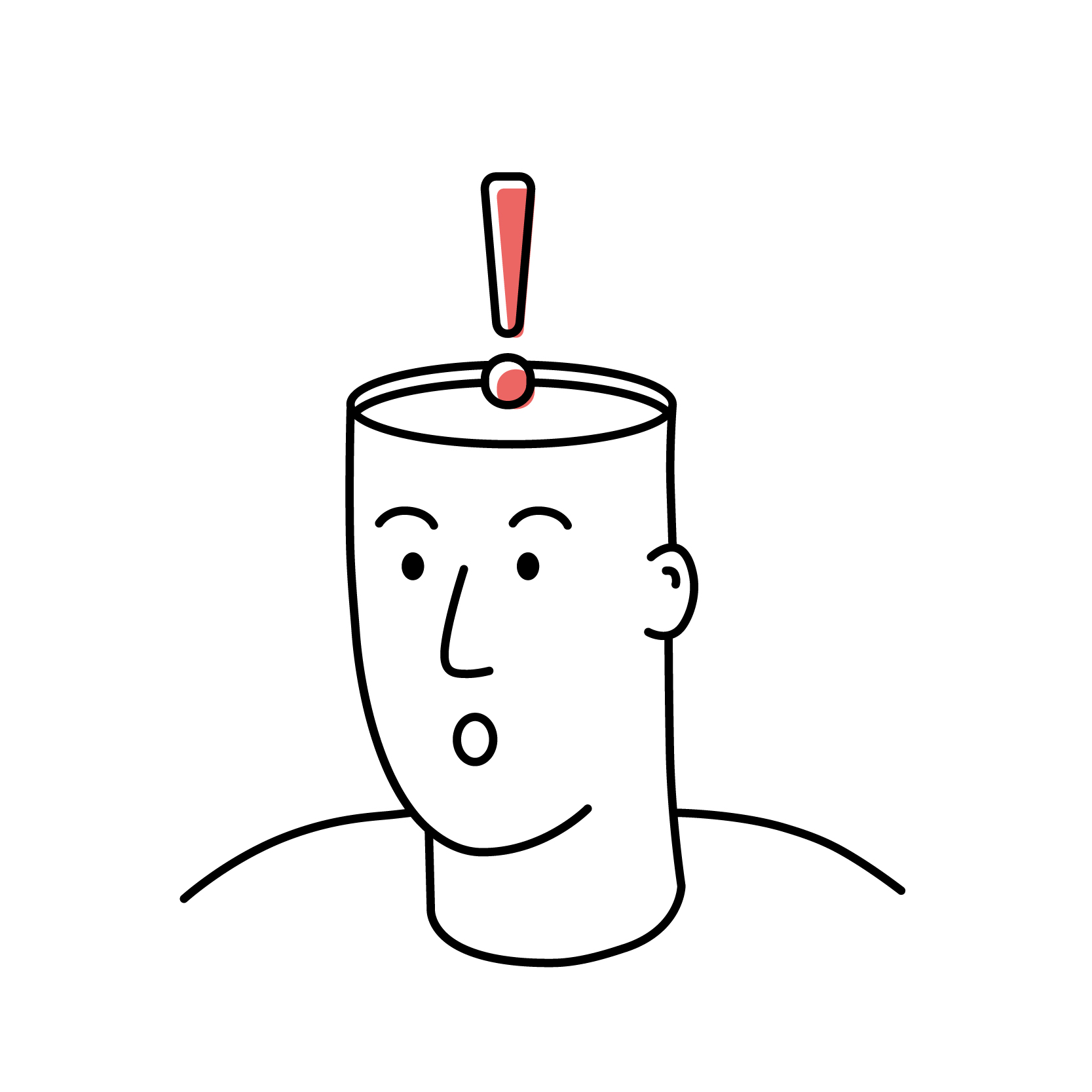
Give feedback
A good way to help humans improve their decision making is to provide feedback. A good example is the Ambient Orb as developed by Clive Thompson that helped people save energy. Electricity isn’t visible, the ambient orb gives feedback on how well you’re doing by changing colour. Another example of giving feedback is paint that is pink when you apply it, but turns white within an hour. People often paint white ceilings white again, and it’s hard to see if you missed a spot. By making the paint pink, it gives you immediate feedback on what is left to paint.

nudging ambient orb
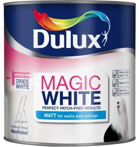
Magic white paint
Expect error
Expect people to make mistakes and design for it. A very good example of libertarian paternalism that actually saves lives are the ‘look right’ signs in London streets. You can still watch the wrong way, but you’re directed to look the right way.

nudging look right
Structure complex choices
When there’s an overload on choice, people tend to find ways to simplify them and break them down. Good choice architecture will find ways to make this more evident for people. An example cited was the choice of paint. Instead of using words like “Roasted Sesame Seed” or “Kansas Grain,” consider arranging similar colour themes next to each other. This could help people to choose the right shades and hues.

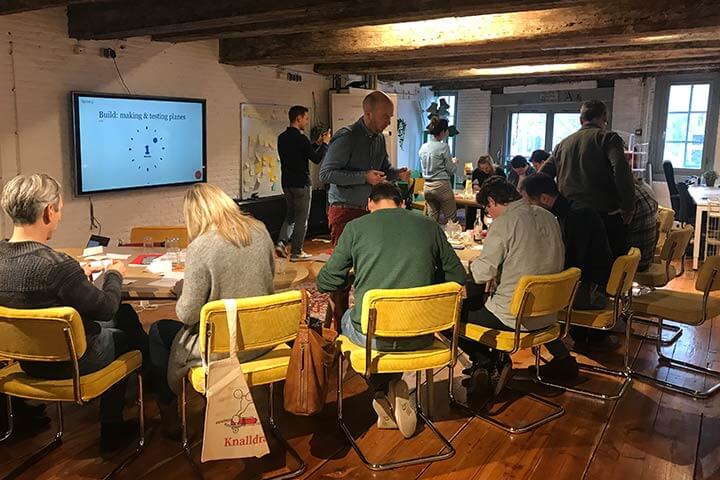
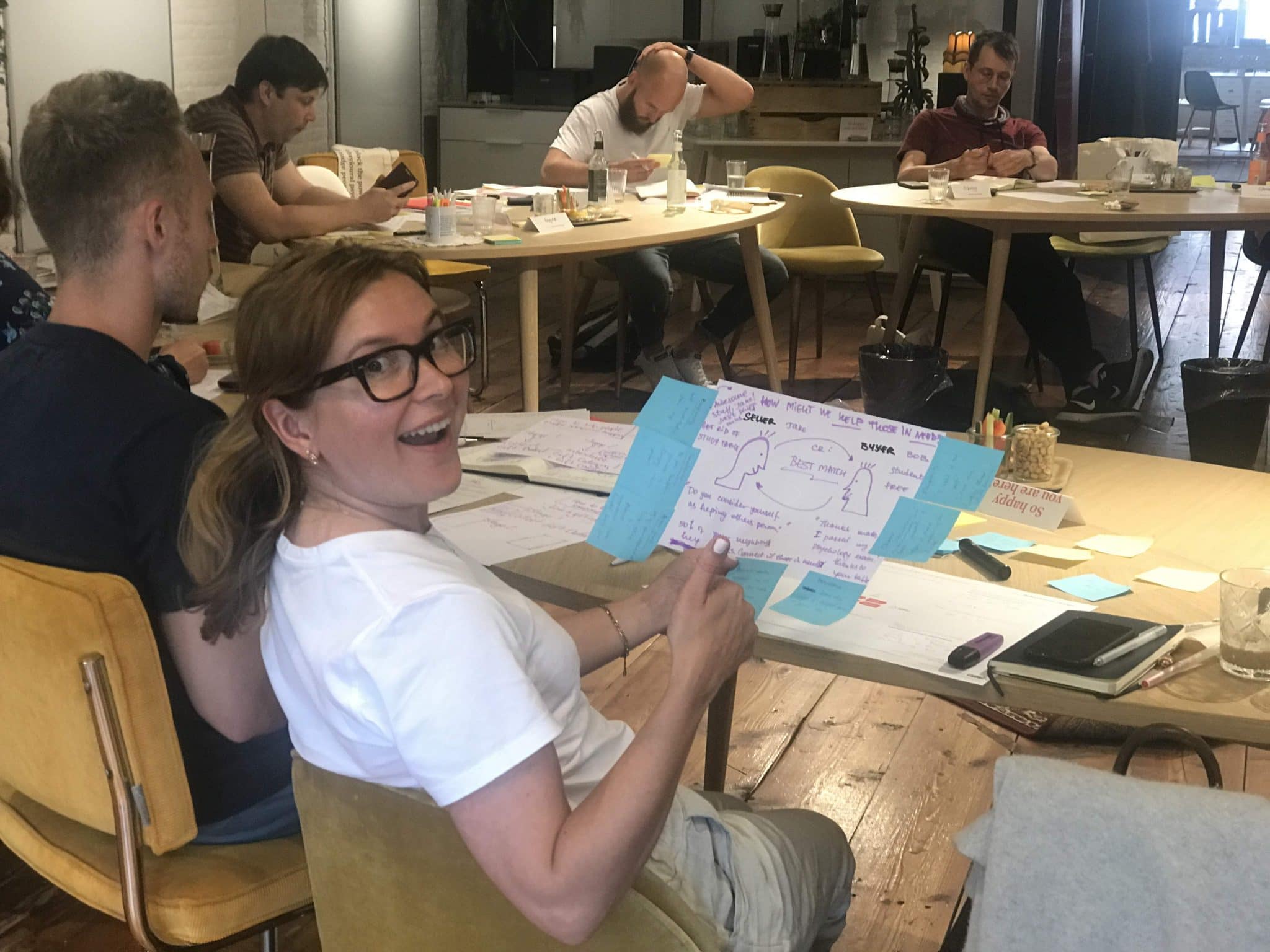
 The situation: we’re in the middle of The Big Quit